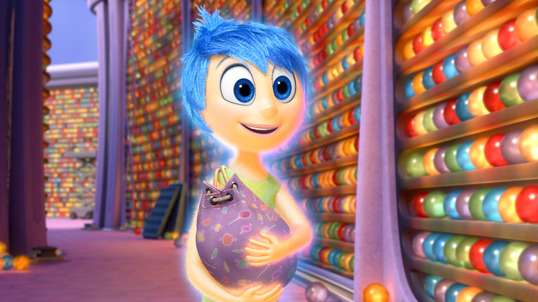
40 Things We Learned About Pixar's 'Inside Out'
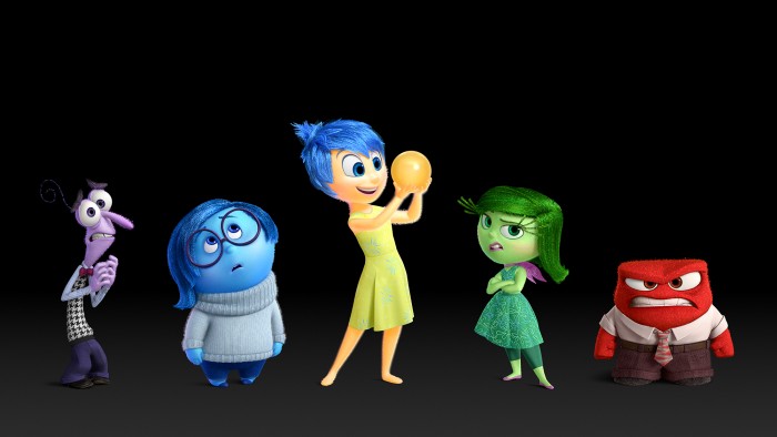
Pixar's new film Inside Out is nothing quite like any film the studio has made before. It tells a story that takes place in dual worlds. One world looks a lot like our own; there, a young girl named Riley finds her world turned upside down when her family moves cross-country just as she hits a period of new emotional growth. The other world is inside Riley's head, where five primary emotions guide her newly rocky life. One is fairly realistic; the other very cartoonish. The contrast between the two gives the movie an unusual feel, especially as the events in each "world" become more difficult for the characters.
Last week I flew up to San Francisco then made the trip across the bay to Emeryville, and Pixar's campus. There I saw the first hour of Inside Out, and sat in on a number of short interview sessions with heads of several departments that contributed to the film, culminating with a talk with director Pete Docter and producer Jonas Rivera. All together they gave a fairly complete portrait of the Inside Out behind the scenes process. We'll feature our talk with Docter and Rivera soon, but first let's look at the technical departments at Pixar. Here are the 40 things we learned during our Inside Out behind the scenes visit.
STORY DEPARTMENT
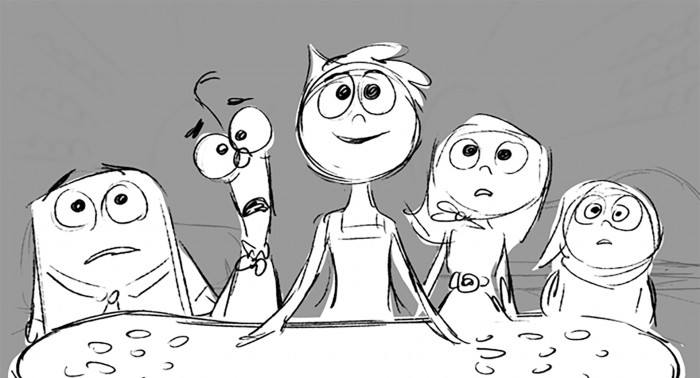
The story department is the core of Pixar's approach to filmmaking. As those already versed in Pixar's process know, in some ways it isn't so different from a TV series' writer's room, or from the writing system used for many other movies. Here, various members of the team gather to pitch character and story ideas; these are drawn out as a storyboard series, pitched and performed to other team members, and gradually refined.
We talked to Inside Out co-director Ronnie del Carmen, who has been part of Pixar's story team since Finding Nemo, but his resume extends way back to Batman: The Animated Series.
1. The very first drawing of Joy had huge pony tails, almost like an exaggerated version of Dee Dee from Dexter's Lab. Sadness, on the other hand, was just a big lump.
2. The dinner scene we've seen excerpted in trailer (below) was the early scene that helped define what the emotions were, and how they work in the film.
3. The story room is decorated with portraits of Pixar employees who draw each other while locked in the room trying to break the story.
4. Story artists will draw the film's characters thousands of times during production, and sometimes hundreds of times per day.
5. The emotions were eventually seen as guardians or advisors that help the "real" characters navigate life. That specification came about after much discussion about precisely what emotions are, and conversations with psychologists that led to defining five dominant emotions.
6. In the beginning, one question was "aren't Riley's emotions her?" But in keeping with that concept of emotions as guiding forces, you are not your emotions — you can choose what to act on, at least in some cases, while for some people emotional guidance may be more overt.
7. Naturally, observations from all the families at pixar, especially stories from parents of their children, became part of the film.
8. In addition to Riley's emotions, "personality islands" define her character, based on specific experiences that become core memories. Chit-chat was an early personality island that was eventually discarded for being too much like two other islands, Friendship and Goofball.
9. The story here isn't just about Riley and her relationship to her own emotions, but about Joy learning to understand and live with Sadness.
***
THE ART DEPARTMENT
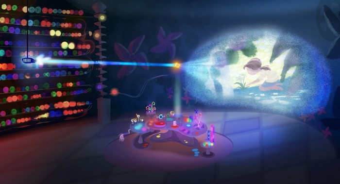
Concurrent with the story development is work in the art department, where production designer Ralph Eggleston, Pixar's production designer since 1992 (he's worked on everything) helps develop the look of the film. In the case of Inside Out, he had two worlds to design, the "Real" and the "Mind," and in some cases he had to design and "build" sets for the inside of Riley's mind that are tremendously complicated, if only seen briefly in the final film.
10. Eggleston worked for five and a half years on Inside Out. He says it's the longest he's ever worked on one film, and the hardest process, too.
11. At one point, Riley's story was half the movie. Now, it's really just enough to make us interested in her emotions.
12. The design brief for the Real world included: hard, flat surfaces; a limited color palette; high key, low contrast light; not many reflections.
13. Minnesota, Riley's family's original home, is visualized with somewhat pastel colors, soft enough to connote comfort. San Francisco, on the other hand, features very desaturated colors, crazy streets, and many power and telephone wires to enhance a sense of chaos. (The idea of using wires in Mind sets was explored as well, but discarded.)
14. This vision of San Francisco is conceptually the opposite of the one in Big Hero 6. In fact, Riley's house in San Francisco is a real place. The address was changed; in the film it is 21 Royal St. which is also a new private dining space in Disneyland, near Club 33.
15. The design brief for the Mind featured: soft surfaces; highly saturated colors; high contrast light; electro-chemical colors; translucence.
16. Note that Inside Out is NOT set in the brain, but the mind. That is, the space in the film is conceptual, not biological. That said, some of the colors and design for the Mind sets were inspired by Brainbows– brightly colored macro photos of pieces of brain "lit" by fluorescent proteins.
17. The lighting and some of the theatricality of the Mind sets was hugely inspired by the look of the Francis Ford Coppola musical One From the Heart. (Also developed and shot in San Francisco, at American Zoetrope, though the story takes place in Las Vegas.) Here's the trailer for Coppola's movie:
18. One of Ralph's first major contributions became essentially the film's opening: Joy's "birth," which takes place right after Riley's birth. He boarded the sequence, "pitched it hard," and saw Pete Docter and John Lasseter fall in love with the idea once it was fully lit.
19. Joy is 4'2", and the "canyon of the mind" is ten miles long, relative to Joy's size.
20. There is some biology in the headquarters set design, with reflections of the hypothalamus and DNA structure. There's also a time-out corner for Anger built into set, but it is never seen in film. There is still a door briefly seen in HQ that leads to that space.
***
CAMERA AND STAGING
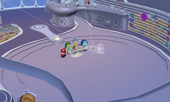
From the art department we go to Layout, also known as Camera and Staging, where Director of Photography Patrick Lin works. He describes the workflow at Pixar in a simple phrase: "camera, action, light." That is, the camera angles and blocking are chosen before animators get to any given shot. The two departments, layout and animation, then work together to finalize a shot, which is finally delivered to lighting.
21. While a Pixar film might be in development for about four years, Layout doesn't go to work until a couple years into the process, when Story has the script mostly hammered into shape and the Art Department and character designers have settled on designs, models, and sets.
22. In keeping with the art design differences between the Real and Mind worlds, Lin and Pete Docter defined different visual language for the two as well. The Mind world is defined by a set of camera department guidelines: "a more mechanical camera movement, which is using dolly, track, boom, and crane, a more controlled movement." The Real features "a more organic movement, using zoom, steadicam and handheld shots." There were also some briefs for focus. The Mind features perfect focus; the Real features some imperfect follow focus, where during action or a fast move the image will occasionally go slightly out of focus, then quickly correct.
23. This is the first Pixar feature where the camera department has begun to model real lens sets to use as virtual tools; in this case the Cooke S4 and the Arri/Zeiss Ultra Primes. They shot lens distortion charts with each set, and imported that data into the virtual tool system. The Cookes were used to shoot the Real world, the Ultra Primes for the Mind.
24. Lin made a chart to rank joy's emotions, and did the same for Riley. It's used to mark how the two characters are separated during each of their stories, and the combination of the data is used to devise a baseline plan for the film's progression of visual intensity. This is Lin's concept for "visualizing the entire movie in one picture."
25. In the Mind, it's all classical Hollywood-style technical camera movement. When possible, Lin and Docter devised "moving master shots," where several actions could be combined into one shot using a variety of camera techniques, but ultimately just a couple of simple camera movements.
26. basically opera camera in live-action using a gearbox as an operator would in real life. use real cameras to capture camera move data.
27. In the Real world, the family's staging almost always has Riley in the center when she's with both parents, before the move to San Francisco. After the move, she's staged outside the parents to capture her feeling of disconnect.
28. There was early talk about using IMAX for the Mind scenes, but that idea was discarded.
***
ANIMATION DEPARTMENT
From Layout the shots go to Animation, which is a process you're probably familiar with. At Pixar animation meetings are collaborative; it's not just Pete Docter giving notes to individual animators. "Dailies" meetings feature a variety of people sitting in on the notes process, and the notes given are heard by the full department, so the people hear everything, and have a guide to keep everyone on track.
29. A new part of the process for this film was that story artist Tony Fucile would sit in on the dailies reviews, and he would sketch notes right into the animation file. This "animation sketch artist" position was valuable enough on Inside Out that it will be used going forward on more films.
30. Fucile's sketched notes stay with the animations as part of the shot file, so any animator has those sketches for reference going forward.
31. Fucile placed a little mirror near his chair so he could keep his eye on the big sketch tablet he used during dailies, and just turn his head a bit to see Pete Docter's face while he was giving notes.
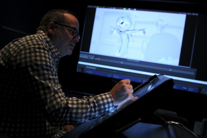
32. These sketched notes could be anything as broad as a big body position revision, to fine notes in positioning eyes, pupils, and small mouth movements.
33. Inside Out featured a small crew with only 45 animators, which is about half the size of previous shows at Pixar.
***
LIGHTING DEPARTMENT
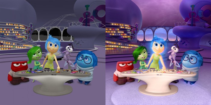
Finally, we spoke to Lighting Artist Angelique Reisch, who offered a detailed look at the unique process of lighting a Pixar film. Above, you can see a side-by-side comparison of one image as it arrives at lighting from animation, and then, on the right, the final effect with lighting added.
34. The most important detail of lighting on this film is that Joy is not just a character, but a light source. She has a discernible glow that can be seen lighting other characters and objects, as seen on the right in the image above.
35. So one big question that came up on this film, given Joy's particular nature, is how they could light a light source.
36. Typically, value — the lightness or darkness of and image — is used to shape character. The idea is to make sure there's a good tonal range in lighting on a character, in order to define them. But Joy is too bright to have that sort of value range. So Joy was shaped with color, rather than value. In the end, all the Emotions were defined with colors, and all feature some inner glow, though Joy is easily the brightest. Working with Pixar, Renderman created a specific light model that created the character lights.
37. The Inside Out lighting team included about 35 people; on the most complex shots, such as one set in the "Dream Productions" movie studio in the mind, there could be over one hundred lights. One Dream Productions shot featured 175 lights.
38. The first step in lighting is a pastel that comes from Ralph Eggleston and his department — that sets the basic lighting scheme for a shot, and the mood.
39. Because those those pastels are very quick to produce, the art department really iterates the possible options for lighting. Once an idea is really determined, the actual lighting department can get to work.
40. The basic lighting principles are the same here as on many films: directing the viewer's eye, creating depth, enhancing mood/atmosphere/drama, conveying time of day, and revealing character personality and situation. But because an image in a Pixar film may have an incredible amount of human-created detail, the lighting scheme is particularly important, to make sure viewers quickly pay attention to the key elements of the shot. You can see in the example image above that lighting doesn't just shade the characters and sets; it also acts as subtle direction for the audience.
***
Inside Out will be in theaters on June 19. We'll have much more from our visit to Pixar coming soon.
